Wednesday, July 31, 2013

New Era Alphabet Challenge - H

Today's cap has a little more of a background than the previous letter. My choice for H, despite having some decent competition, is a cap that comes from another learning experience from the early days of my collecting. Specifically, if you think you're gonna regret not getting it, then you'd better get it.

In an earlier installment of the Alphabet Challenge, I referenced a purchase made in 1996, and the StarStruck catalog that came with each purchase. After I received the catalog, I poured over it, studying every cap, every logo, dreaming of how cool it would be to have a number of these caps. I was quite limited in funds at that time, so I had to stick with what I considered essential, which were the three I had bought. The rest would have to wait.

Little did I realize that sometimes logos and affiliates change. By the time I got around to expanding my collection, several of the caps that I had my eyes on in '96 were no longer available. After a brief period of mourning, I started scouting eBay. Eventually I did come across a fitted version of one of the caps I'd coveted all those years ago.

It is representing letter H:

Defunct logo of the Helena Brewers.
There was just something about this one that caught my eye. I just knew this was one I wanted. I was very ecstatic when I was able to add this one to the collection. Let's just say it was a life changing experience. Now, I'm a lot less likely to hesitate if I think there's a chance a cap may not be available down the road. Sometimes I'm wrong, but those times when I jump and then find that the cap is no longer available, well, win for me.

Early last decade I also was into collecting Minor League baseball jerseys. A Helena Brewers road jersey became available on eBay and I got outbid at the last second. I was devastated! I knew (and I've been right for 10+ years) that I would never see another one. I always referred to that jersey as the one that got away. I'm over it now, mainly because I don't buy jerseys anymore, but it took a long time.

The current Helena Brewers logo is a nice one as well, though I have not picked one up. I probably will at some point, but I'm not as desperate for that one as I was this one. They did have a cap that had a variation of the current logo H inside a gold state of Montana. Very awesome, but it was one of those old meshy style BP caps. No thanks. Would love to see it on a 59Fifty. Here is a 39Thirty version of it from their website:

So Helena Brewers, think about it. If you build it, I will buy...

Anyway, to summarize, my advice to anyone who collects caps:  Just get it. Don't be that person who hesitates then regrets it later on when they can't find the cap. Just get it.

Now, onto the H caps that didn't make the cut:
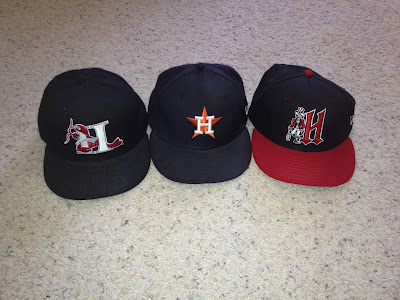
Yes, I passed over the classic Houston Astros.

Funny thing about the Astros cap. When I was but a lad in the early 80s, my very first baseball hat was a mesh (now called "trucker") California Angels cap on sale in a Stater Bros grocery store. They had a rack full of these caps, and my dad would let me get one every month for a while. The mesh version of this Astros cap was the second cap I had gotten. I think I was caught up in the hype of Nolan Ryan's no-hitter, but the logo is somewhat nostalgic for me. I ended up with about 10 mesh caps, but they are long gone.

Tuesday, July 30, 2013

New Era Alphabet Challenge - G

Moving on tonight to Letter G. I honestly don't have any particular story behind the cap I chose. I remember I bought it for its simplicity and unique colorway. Also, the team is an affiliate of the Red Sox, so the G was stylized to look like their cap, except this one was done in a deep green, so it looked cool.

Greenville Drive. One letter says it all.

Yes, the Greenville Drive. Not a very exciting name. Especially considering they were the Capital City Bombers for 12 years prior. Of course, naming your team Capital City is kinda lame as well.

As I said, no real story behind this one. I just like the color. Good looking hat. Not much else to say about it.

Here are the other two G caps I own:

Both of these are Greeneville Astros caps.
I like that orange hat so much, if I were to do this again in another year I might choose it to represent G.

And that's all I have to say about that.


Monday, July 29, 2013

New Era Alphabet Challenge - F

Today's cap choice not only represents the letter F in my Alphabet Cap Challenge, but also represents a tough lesson I learned about cap collecting. That is, don't get rid of a cap if there is the slightest chance that you might want that cap again someday. Actually, now I don't ever get rid of any caps.

Well, I did give a University of Wyoming cap to a friend, but that's excusable because I had three of them, and the one I gave her was a few sizes too large. I actually have two entire New Era 24 cap carriers filled with duplicates. But those are for years down the road in case of loss, or God forbid, another theft.

Anyway, the cap representing letter F is...

I really didn't care about losing this one, until it became the one I couldn't live without.

In 1993, on the eve of the inaugural seasons of the newly minted Colorado Rockies and Florida Marlins, I decided to make a trip to my local sports apparel store, which if I recall was a Pro Image located in the outlet mall in Barstow. My goal was simply to acquire my first Rockies cap.

I had decided to become a Rockies fan for two reasons:
1) I have family in the vacinity (Wyoming, actually)
2) On visits to see said family, I fell in love with Colorado.

It was difficult, seeing how I had grown up a California Angels fan. I figured it was no big deal. I could root for both. They played in different leagues and never played during the regular season. (a valid statement until interleague play ruined everything) So I was off to purchase that first Rockies cap. When I got there, they also had the cap of the other expansion team, the Florida Marlins.

Now, keep in mind I was not necessarily a "collector" at that point, but there was something about that awful teal and weird fish that just made me have to buy that cap. So I left the store with one of each.

I honestly don't think I ever wore the Marlins cap.

I'm not entirely positive but I believe I gave that cap to my at-the-time girlfriend's younger brother. That was 1995 when that happened. I did not miss that cap until around 2010, when talk started circulating that the Marlins were planning on changing their name to the Miami Marlins and doing a complete rebranding. That would mean no more teal. And it had been many years since the Marlins had donned the all teal cap during a game anyway. Who really liked teal anyway?

I reflected on how I once owned that cap. Oh, what was I thinking? How could I just give a cap away like that? Why didn't somebody tell me that 15 years later I'd really, really be wanting that cap?

So I trolled eBay and eventually found a mid-90s model. High crown and everything. It was fine, but then one day I found a more modern version at lids.com. Yes, made in China. Yes, it has that uniquely velvety material and pizza box visor, but oh man it's a good looking cap.

I proudly select this cap to represent the letter F, and give my solemn promise that I will never part with this cap again.

And for the record, the one I bought on eBay is inside one of the cap carriers, just in case.

Like E, I have a limited number of F caps. Here are the other two that I own.

I don't know why I bought the Fresno cap, honestly. However, I love the Frederick cap.


Sunday, July 28, 2013

New Era Alphabet Challenge - E

Today's cap representing E could be split into three different blog posts. Interesting considering this isn't a standout classic logo like some of the others have been. In fact, it's a somewhat obscure short season minor league cap. It just happens to have one of the coolest and creative logos to come out in quite a few years.

So without further adieu...

Turning the Seattle Mariners classic trident logo 90 degrees. Ahhh... clever.

The road cap of the Seattle Mariners short season-A Northwest League affiliate Everett Aquasox. Purple and aqua never looked so good together. And as for that logo? It's so simple, just a twist on the throwback Mariners trident logo. How did nobody think of this before? It's perfectly genius!

This leads me to something which I will only briefly touch on. This logo was the work of a design firm then known as Plan B Branding, now known as Brandiose. Those with whom I've had more in depth discussions about logos know how I feel about Brandiose. They've done some great work, as evidenced here as well as the now defunct Casper Ghosts, Tulsa Drillers etc. But the work they've done lately, in my opinion, has been an exercise in how gaudy and tacky can one make a team's identity. Clearly, they are doing something right because by and large, people are clamoring for their business, and the sales of rebranded merchandise seems to be doing very well for the teams who do utilize their services. I just look at minor league logos in particular in terms of longevity. And none of the recent rebranding efforts I've seen have that future classic quality. They are very flashy, but I just don't think 20 years from now someone is going to look at a piece of asparagus on a cap and go oh yeah, love that Ports cap. That's not to say I don't respect the work they do, some of it is fantastic, but there's a reason why the E representative is the Everett trident E and not the Eugene Emeralds Sasquatch footprint E. I just don't like the look of it. My hope is that this recent trend of over the top jersey colors and cap logos ends quickly. People shouldn't have to look at the cap I'm wearing and go "what the heck is that?" A team's logo is its identity. It should to an extent represent the story of that team. It should not, however, have to literally tell a story.

Just my two cents.

Also, this particular cap is made in China, as opposed to traditional minor league caps which were made in the United States. I went through a phase where I was appalled at the quality of the Chinese caps. There really is a completely different feel to them. Everywhere from the visor, to the crown. Even the fabric is different. Some are worse than others. Again, I could get into a lot more detail, but I won't. Let's just say that even though this Everett cap is my choice to represent the letter E, wearing this cap today reminded me of why I developed such a deep disdain for the Chinese made caps. The crown feels too high and the visor feels like it was cut from a take home pizza carton. I seriously wish there was a way I could get a replacement of this cap with a guarantee that it would be a US made one.

On a side note, this season's crop of minor league caps I did get included some that surprisingly were US made. I was very pleased.

Moving on, I don't have a lot of caps that sport the letter E, so here are the rest. Or the other two:

Defunct caps. Edmonton Trappers and the old Eugene Emeralds.

Saturday, July 27, 2013

New Era Alphabet Challenge - D

Letter D was not as big of a challenge for me as the last few days. In fact this one should be fairly obvious, but that could have been said for the last two as well. However, this one is unique as it will always remind me of a television program from my early adolescence. So cue the Mike Post theme music... Representing Letter D is...

Detroit Tigers. Just so cool.

Anybody who grew up in the 80s has to have at some point stumbled across Tom Selleck in the fantastic show "Magnum, P.I." Say what you want, Magnum was just cool. He lived in a cool house in Hawaii and drove a cool car. Though I was in my early teens, the thing that always stood out to me was the fact that he almost always wore a baseball cap. Not just any cap, but a genuine cap of a Major League Baseball team. That team was the Detroit Tigers. This was long before sporting team merchandise was a thing. If you did see anyone wearing caps, it was of the mesh/adjustable variety. (myself included)  Magnum's appeared to be quite authentic. It sort of made me jealous that I didn't have an authentic Angels cap. This wouldn't have been possible in 1982 as there wasn't anywhere local to me that would have carried such an item. Nevertheless, the Tigers cap is as classic and timeless as any of the other logos that have been in use for the better part of 100 years. Though the Tigers have had some alternate caps in recent years, any change to the primary logo, in use since the early 1920s, would be criminal. So thanks to Thomas Magnum for inspiring me to have this cap in my collection. Okay, I would have this cap regardless, but I will always think of that show when I see the Tigers cap.

The coolest moustache outside of John Oates.

So since I've chosen the Detroit Tigers as my cap to represent the Letter D, here's the modest collection of other D caps I own.
Is it Denver Broncos, or Durham Bulls? (joking)

One last thing about choosing the Tigers cap. As most people know, my favorite baseball team is the Colorado Rockies. I've been a fan since Day One and I bleed Rockies purple. Nobody can question my loyalty that I have for this team. I own nearly 30 unique Rockies caps, by far more than any team in any sport. However, I am a collector, and as a collector I enjoy owning, and occasionally wearing caps of other MLB teams. There are many other people like me, and I don't think any rational person would question our loyalty to our favorite teams.

So imagine my amusement when I stumbled across this editorial on strictlyfitteds.com today (the day I'm wearing a Detroit Tigers cap) that more or less states that people who do this have "no excuse to wear the cap of a team you don't root for." The reason? President Obama.

Read it here.

Friday, July 26, 2013

New Era Alphabet Challenge - C

Today I had a lot of really classic caps to choose from. Some classic Major League Baseball teams happen to sport a solitary letter C on the front of their cap. But I decided to go with one that has a little more personal historical value.

Representing the letter C:

UConn, not Yukon.

University of Connecticut Huskies. I happen to be a fan of their basketball team, men and women. The story behind how I became a UConn fan is the subject of an earlier blog post, which you can view here if you're curious. It's a funny story, actually.

But as far as the cap goes, here's some background: I purchased this cap in 1996 after receiving my very first StarStruck catalog*. I purchased this cap along with a St. Paul Saints and a Salt Lake Buzz cap. My serious collecting was in its infancy, but it was really one of the first caps I acquired that was outside of my comfort zone of Angels, Rockies, Lake Elsinore Storm and a handful of other ones I had picked up on trips to Colorado. Mail ordering caps was new to me. Back then you had to actually dial a number and place an order over the phone. There was no computer tracking number. You just had to wait patiently for the mail to arrive every day. Sigh... the 90s...

I have since acquired an updated version of this cap, with a fancier C and a navy button instead of the white one here. I like it, but it'll never match the simple elegance of this one. Also, even though I don't really talk about NCAA basketball much, UConn is one of the few teams I follow that have actually won a championship. And if you read the story I linked above, there is always that element where a memory of my father is involved. And that's why I chose this cap to represent letter C.

Sorry Cubs fans.

Here are some of the other C caps I have that I also own:

Some great logos, but not as much meaning to me.

I want to point out that the front left cap (Connecticut Tigers) is in my opinion one of the coolest logos in minor league baseball. An old English C? Oh, how I love it when a minor league team incorporates the parent logo into their own.


* If you never browsed a StarStruck catalog it is indeed a shame. I think old school cap collectors will agree that they were as close to a hat bible as you could get. It was a sad day when StarStruck stopped carrying minor league baseball caps.

Thursday, July 25, 2013

New Era Alphabet Challenge - B

Today's letter might prove to be somewhat unpopular with some baseball purists. There are some obvious choices when it comes to caps sporting the letter B, and it may raise some eyebrows that I did not select one that people think I should.

But that's why I'm blogging about this.

And for the record, I don't even own a Boston Red Sox cap, so chowds can stop reading right now.

I own nine caps sporting a single B on the front, and the one I've chosen to wear today is this one:

Simple. Clean. Sharp. Bakersfield Blaze.

I fell in love with this cap the first moment I laid eyes on it. Solid black, black scripted B accented by orange and white. After a few years of sporting the so-called flaming leaf logo, the Blaze smartly rebranded, deciding to go against the trend of gaudy and grandiose (ha) and rolling out this very simple look. It's a classic and timeless logo, and I for one place this in the top echelon of minor league baseball caps.

In case you're curious or have never seen it, here is the previous Blaze logo:

Seriously.

At first I was skeptical, but of course I had to have one. Now that it's defunct, I'm sure glad I do have one.

And what of the letter B caps I passed over? Well, here's a quick glimpse:
Brought to you by the letter...
So as you can see I passed on the classic Brooklyn Dodgers cap. This is not a slight to them, I'm just more at home with minor league logos, I guess. The Dodgers in particular are a team whose history is overwhelming, and in no way can anyone diminish what they accomplished socially. Truth be told, I simply wear the Bakersfield cap more.

Ironically, when Bakersfield was a minor league affiliate of the Los Angeles Dodgers in the 90s, this is the cap they wore:


Wednesday, July 24, 2013

New Era Alphabet Challenge - A

So just to do something different I've decided that I'm going to wear a different New Era cap every day (that I'm able) featuring a different letter of the alphabet starting with A. No reason for it. It just gives me a reason to examine the different caps that I have and challenge myself to choose one to represent each letter. Some will be easy, others will be difficult, but I'm going to be keeping a record of each choice I make here. Hopefully one per day. We'll see how it goes.

Of course, if anyone wants to make a comment or critique, I encourage that, as I'm always interested in hearing what other cap aficionados think. Comment here or on my Twitter @interstate19.

Anyway, on with the show...

We begin with the letter A:

California Angels (1972-89) The cap that started it all...

This one was a no-brainer. I grew up a California Angels fan, and this is a remake of the first fitted New Era cap I ever acquired. My father bought this for me on my birthday in 1989 and so it's a cap with tremendous significance to me. We attended a game on that day at Anaheim Stadium and he told me to buy whatever I wanted. I got this cap and an authentic Angels Rawlings jersey which is now waaaaay too small for me. Oh, I wish I had been thinking a quarter century in the future when I bought it.

Basically, this is logo of my youth. My fondest memories growing up an Angels fan are tied to this logo. The ballgames I attended with my father. Knowing every detail about the rosters, stats and standings.

Waiting after games and trolling for autographs. Great memories. Dozens of stories there alone. Getting yelled at by Reggie Jackson. Getting a phantom Dan Quisenberry* autograph. Rod Carew (who was one cool dude!) My dad getting Glenn Hoffman's autograph thinking he was with the Angels when he was with Boston. Bob Boone (cool guy) Tim Foli (a-hole) and of course, Brian Downing, who is my all time favorite Angels player.

Being 11 and getting involved in a "bullshit" chant with 60,000 fans because Reggie Jackson was ejected after fighting the Royals' Frank White. Doug DeCinces hitting two home runs and being robbed of a third. Tony Armas "walk off" home run in 1989.

Being an inch in front of my television in 1986 when the Angels were one strike away from heading to the World Series... I could go on... 

This one is so important to me, I actually reserve a special place for that original cap.

24 years old. A size too small.

A simple letter A with a halo. I always appreciated the Angels returning to that logo (as currently used) but for me, this one stands out as the best of all of their logos. I'll never understand why in 1990 they went from this A to the nasty "fat A." I hated that.

Incidentally, has any team ever used as many logos (or names) as the Angels have in their 50 years? Ha!

Just for full disclosure, here are some of the other letter A caps that I passed over:


So agree or disagree, fire away!

*yes, Quisenberry was with the Royals, but he was my very favorite non-Angels player in the 80s. Loved his style. Approached him for his autograph, but I didn't have a pen so he grabbed the hat off my head and pretended to sign it, put it back on my head and walked off. It was awesome. RIP